10K Brewing
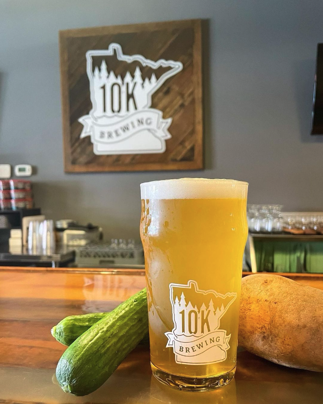
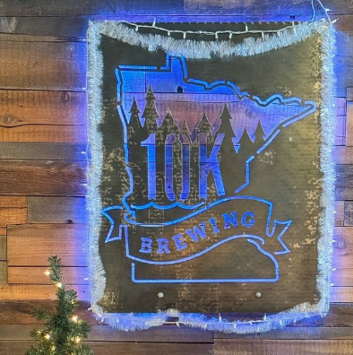
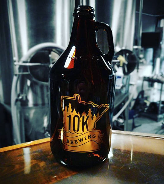
The logo for 10k Brewing features a clean and modern design that incorporates bold typography. The primary element is the name "10k Brewing" prominently displayed, with "10k" in a larger, more stylized font that gives it a distinctive look. The color palette is typically warm, featuring earthy tones that evoke a sense of craft and quality. Surrounding the text, there may be subtle graphic elements that reflect the brewing process or the local community, enhancing the logo’s connection to the craft beer scene. Overall, it conveys a sense of creativity and craftsmanship, appealing to beer enthusiasts.
